“The issue in Web accessibility is the fact that blind and visually-impaired people need the single biggest boost to achieve equivalence since the real-world Web is a visual medium.”
— Joe Clark
Esperanza Spalding sings about perception in her song, “Touch in Mine” where she describes the sensation of being able to feel, listen, and learn from the environment through the sense of touch. However, before something can be perceived, that particular stimulus must be available and furthermore, above the person’s absolute threshold. For example, depending on a person’s age, a human’s ability to hear sound ranges from roughly 30Hz to 20kHz. The lower and upper limits can be thought of as the absolute threshold because these numbers represent the lowest and highest levels that a stimulus can be detected.
When it comes to the web, users must be able to perceive the information provided using various forms of assistive technology such as refreshable braille displays, screen readers, or screen magnifiers. Each of these methods provides a way for the user to interpret the information presented. With so many ways to convey information, if users are having difficulty perceiving the information, alternative methods should be used.
❌ Bad example of a simple close button.
<button type="button"> X </button>

✔️ Good example of the same close button with an aria-label to provide more context.
<button aria-label="Close modal"> X </button>
When teams set out to build an accessible product, they often either get struck with task paralysis or jump directly into solving the accessibility violation without fully understanding the nature of the problem. Developers may want to know what ARIA attributes to use. Designers will want to know what colors they need to use to fix issues with their current designs. Management will want to know if making something accessible has a return on investment. While it’s not wrong to be concerned about these details, not having a clear understanding of “the whys” can result in teams looking at making things accessible as ‘extra work’, or even lead to teams implementing things incorrectly. By having a better understanding of the four basic principles of accessibility, teams will be able to ask themselves the right questions. For example: “What can I see?”, “How will a screen reader convey this message to the user?”, or “Can I successfully complete a task without using a mouse?”
This is where the WCAG and POUR come into play.
Real quick, the Web Content Accessibility Guidelines or (WCAG) for short, is a set of success criteria whose goal is to direct content developers in building accessible products for people with disabilities. In our societies, the term “disability” is thought to mainly apply to capital “D” disabilities like Cerebral Palsy or Blindness, for example. But making things accessible also helps individuals with impairments such as wearing glasses or having a broken arm. All are disabilities that affect the user’s ability to perform an action or perceive information in some way. The WCAG is broken into four different sections that focus on specific needs. These four sections are known as POUR, which is short for Perceivable, Operable, Understandable, and Robust. Understanding the guidelines in these sections will help teams identify the areas of their products that need to conform. Depending on the product, it’s very possible that every rule in a particular section will not apply which is OK. For example, if the project doesn’t have video elements, the content creators shouldn’t have to worry about Section 1.2 which focuses on time-based media.
Perceivable
The first section in the WCAG covers Perceivable. As mentioned earlier, perceivable means users must be able to interpret the content by the use of their available senses. Until the day comes when users can taste and smell digital content, content producers must focus on the user’s ability to see, hear, and or feel the available content. Section 1 – Perceivable has guidelines for providing transcripts for video content, or machine-readable text for image-based content. Text descriptions give anyone with hearing loss or in an environment where the hearing is impaired, the ability to understand the information conveyed in the video. Providing text descriptions for images in the form of Alt attributes makes the content available to assistive tech such as screen readers and braille displays.
❌ Bad example. Images without an alt attribute either expose no information,
or only the file name will be announced.
<img src="bamboo-grove-20190214.jpg">

✔️ Good example of how to add an image using the "alt" attribute.
<img src="bamboo-grove-20190214.jpg" alt="A bamboo grove in Arashiyama">
Operable
The second section, Operable, provides guidelines on how to ensure interactive content will be available to those using various types of technology. Because people use computers in different ways, there are a variety of methods for accessing and interacting with digital content. While the keyboard is a common tool used to interact with computers, it is not the only method. There are individuals who have disabilities that affect their motor control preventing them from using a mouse or keyboard. Keeping this in mind, teams need to ensure their interactive controls are accessible to the various input devices.
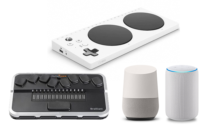
Top: Xbox Adaptive Controller
Bottom Left: Brailliant BI 14 braille display
Bottom Center: Google Home
Bottom Right: Amazon Echo
Understandable
Next up is Understandable. Being able to understand content goes beyond comprehending the words. It extends to the UI and UX as well. For example, presenting a consistent, well-structured navigation scheme throughout a website will allow for a better user experience. The most common disabilities are cognitive so content producers need to be cognizant about how the content is written and presented. Asking questions like “Is the message clear and concise? Or is it ambiguous?” are a great place to start critically analyzing content. At some point in time, whether signing up for an event or purchasing movie tickets, users will be required to interact with a form. Ensuring the form elements are labeled correctly with clear instructions can be a key factor in improving the overall experience by reducing cognitive load.
❌ Bad example of an input field
<input type="text" id="firstname" name="firstname">

✔️ Good Example of an input field using an explicit label.
<label for="firstname">First name</label>
<input type="text" id="firstname" name="firstname">

✔️ Good Example of an input field with an implicit label.
<label>
  First name
  <input type="text" name="firstname">
</label>
Robust
Last but surely not least, there’s Section 4 – Robust. When a product is robust, it is accessible to any number of devices. Providing accessible digital content begins with semantically correct, and valid markup. Doing so ensures the content will be compatible with a range of devices and user agents used to present digital content. In this day and age, where teams are using frameworks to develop single-page applications full of custom components built from scratch, HTML’s built-in accessibility is often left behind due to invalid or unsemantic coding practices. By writing semantically and contextually appropriate markup to build simple to complex UI components, teams will automatically benefit from the built-in functionality and rendering provided by user agents.Don’t get me wrong. I’m not saying that custom components a bad thing. But custom components should maintain as many of their native HTML accessibility attributes as possible. In fact, many of the JavaScript frameworks such as Angular, React, and Vue have accessibility features built into their cores so teams can access them as needed.
❌ Bad example of a button component.
While this example technically works, it's not semantically correct.
To accommodate tabbed navigation, you'll need to add a tabindex="0"
to make this “button” focusable.

[...]
return (
  <div>
    <span role=”button”>Click</span>
  </div>
);

✔️ Good example of a button component.
Because this is a native button element, it will receive focus
without having to add tabindex="0".

[...]
return (
  <div>
    <button type=”button”>Click to Trigger</button>
  </div>
);
By having a better understanding of the WCAG and the POUR principles in addition to making accessibility a core component of the project, teams can begin to build more inclusive products with confidence.
Jason says:
What a very good overview of the POUR principle!
One constructive criticism, though: your first example contrasts two methods of implementing a close button. I understand that this particular example uses an `aria-label` to better accessibly label the button. However, there is one additional minor difference between the two approaches illustrated, and that is the removal of the `type` attribute on the second button. While I understand this is not the point of the example, I’d fear that someone who stumbles on this might extrapolate that the removal of the `type` attribute might be part of the more accessible solution.
Homer Gaines says:
Hey Jason,
Thanks for pointing that out and you are correct. That is a typo. The button type should be there.
Thanks!