Introduction
This post will demonstrate how to use automated and manual accessibility testing tools on desktop and mobile websites. We’ll cover five accessibility testing tools that can be installed either as browser extensions or JavaScript bookmarklets. I will point out the pros and cons of each testing tool, describe the best features of each tool, and show what accessibility problems each tool is good at identifying.
It’s important to remember that automated accessibility testing tools can never replace manual screen reader and keyboard-only testing. We’ll discuss how automated, page-by-page accessibility testing tools fit into your manual testing process and how using automated tools in early development stages can save time for QA testers to avoid documenting very basic accessibility problems.
We’ll talk about what a11y testing tools work on desktop web browsers and what testing tools you can use directly from a mobile device. If you’re testing a responsive designed website’s desktop and mobile views then you can still use the same desktop Accessibility testing tools to test an RWD site.
Learning Accessibility through Testing Tools
Installing and using automated and manual accessibility testing tools is a great way for developers and QA testers to learn accessibility without jumping straight into the complexities of learning manual screen reader testing.
Accessibility testing tools will help you learn web accessibility because most of them include some help documentation for the errors or do a good job of obviously pointing out errors that you will learn to avoid while coding.
Rather than learning WCAG first you can drive right into using Accessibility testing tools and know that if you fix all the problems multiple tools report then your site will probably be pretty accessible without even reading WCAG or using a screen reader.
Testing tools can’t find all accessibility problems so manual testing using the keyboard alone and using the screen reader is always required.
Learning and Using Testing Tools vs. Screen Readers
It’s much easier to learn how to use a simple Accessibility testing tool than an assistive technology software. Screen readers are very complex and sometimes testers can report false positive accessibility errors based on misunderstandings about the normal screen reader behavior. The screen reader may need to be installed, may cost money, may slow down your system or there may be other reasons it’s not possible to always test with a screen reader.
Keyboard-Only Testing
http://pauljadam.com/demos/focusvisible.html
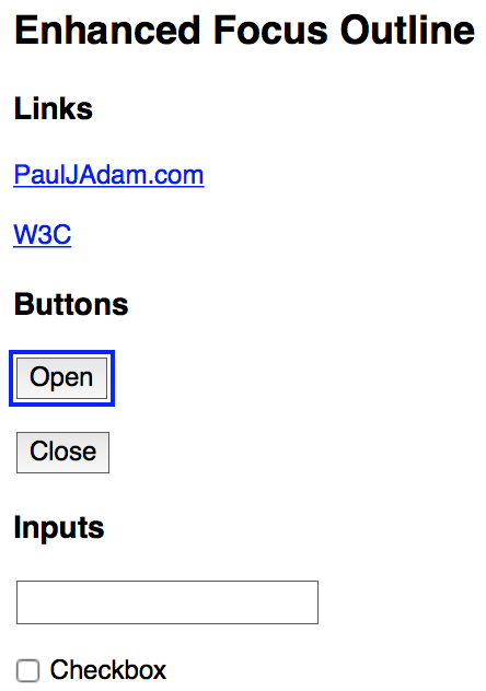
Keyboard-only testing is the simple and powerful accessibility testing method that is guaranteed to find problems either with missing keyboard focus indicators or just plain non-focusable and non-keyboard operable controls. The modern web is terrible at designing and coding for keyboard operability so before you spend too much time learning screen readers make sure to always do basic keyboard only testing by TAB navigating the page and trying other keys for complex widgets like Escape for menus and dialog, Up/Down/Right/Left arrows for other custom controls.
The ARIA Authoring Practices will tell you how these custom controls and widgets should behave and be coded for screen reader and keyboard users.
Pushing Accessibility Testing to Developers & Designers
https://www.w3.org/TR/wai-aria-practices/examples/landmarks/main.html
The benefit of automated accessibility testing tools is to get developers and designers using these tools as early as possible and fixing their own accessibility issues before they go to QA and Accessibility testers. Using automated tools in early development stages can save time for QA testers so they can avoid spending time documenting very basic accessibility problems that developers could have noticed using one of these testing tools.

If you’ve ever written an accessibility report with more than 100 issues then you’d appreciate not having to spend time writing issues and recommendations for simple failures like missing alt text, missing form labels, or low color contrast that an automated tool can easily discover.
Integrating Tools Into Your Manual Accessibility Testing Process
During manual screen reader and keyboard-only accessibility testing you can also run automated testing tools from browser extensions and bookmarklets to help you find more issues than manual testing with AT or keyboard alone.
Using these testing tools is basically a combination of your manual testing process of the test scope or user flows and for each page you visit or screen or dialog you’ll run all your favorite accessibility testing tools, document the problems and then do screen reader and keyboard testing before or after using the automated tools.
Everyone has a different process and flow for accessibility testing, there’s no right or wrong order so it helps to run multiple testing tools, test with keyboard only, test with multiple screen readers, and also test on an iPhone or iPad to find even more problems. The more testing methods you use the more problems you’ll find and you will eventually pick some favorite tools and techniques and repeat those for all the websites you test.
Five Accessibility Testing Tools for Your Toolbox
- WAVE
- aXe
- a11yTools
- tota11y
- HTML_CodeSniffer
These are five of the accessibility testing tools that I like to use on a regular basis for accessibility testing and reporting. Each tool has some pros and cons and each has certain accessibility issues they’re great at identifying.
Accessibility testers each have different preferences for accessibility testing tools and what browsers and developer tools in general that they use. I’m a macOS and iOS user and Safari is my favorite browser for personal usage and for code inspection and a11y testing.
Safari and Chrome are my main two browsers and I use Firefox occasionally for testing tools and double checking certain issues like keyboard focus visibility.
Good/Bad Accessibility Demos & Testing Pages

To learn how to use accessibility testing tools run them on some good and bad accessibility demo pages, read all the errors that appear from the bad pages, then run them on the good pages and see the differences.
I will use these three sites as testing examples for the tools below.
WAVE

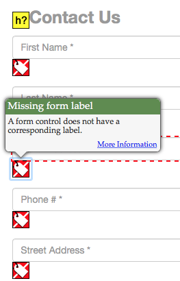
WAVE was one of the first accessibility testing tools I ever used and I still find it very valuable when I’m testing.
WAVE is available for Firefox, Chrome as browser extensions or you can use it from the WAVE website as a online testing tool. WAVE browser extensions are much more powerful than the WAVE website because you won’t be able to use the online WAVE behind password protected websites and sometimes the online version does not work on very complex websites. The WAVE extensions work behind a firewall, are faster to run tests, and handle complex websites.

Basic steps of using WAVE are to visit each page you want to test and click the WAVE icon button in the browser extension to see the accessibility violations.
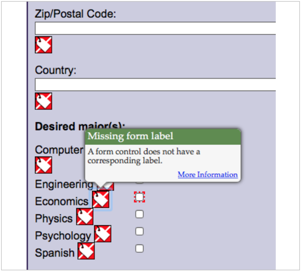
Click the icons that appear and you can read the accessibility errors or success messages in the icon tooltips.
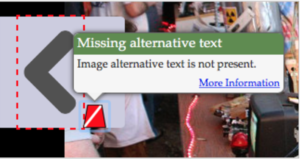
Click the Contrast tab to see the color contrast errors on text. Automated tools usually don’t find contrast errors with Placeholders or Images of Text so you have to manually test their contrast. For manual contrast testing of anything an automated tool will miss I recommend the Colour Contrast Analyser.

The No Styles tab will show the page without CSS styles and make it easy to find WAVE error icons that were visually hidden due to the page layout. So remember when you don’t see the error icons on the page they may be visually hidden and you need to check for them under the No Styles tab.
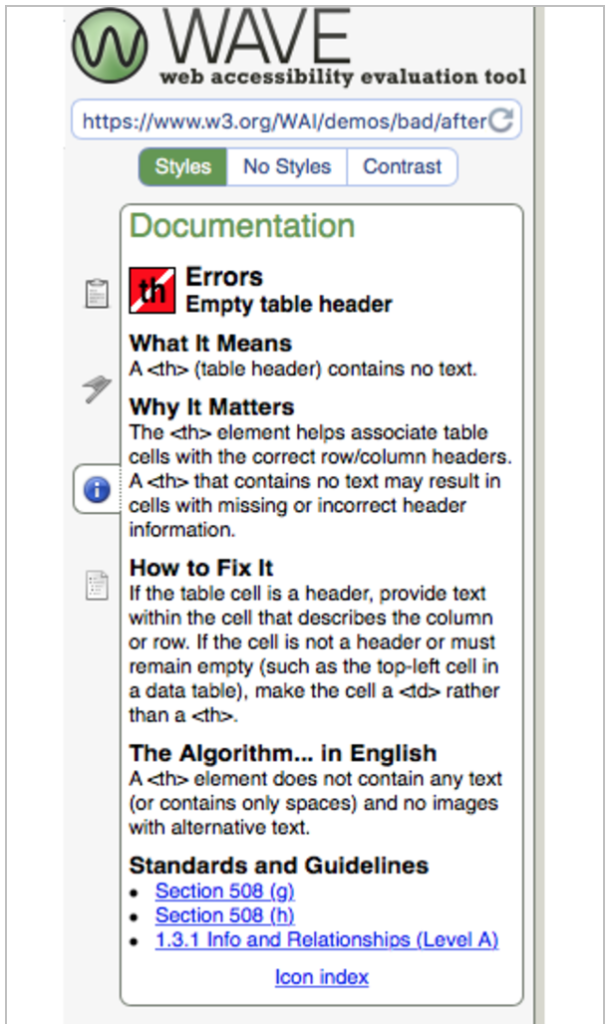
Download link
You can visit the WAVE Online Report of our testing pages here even if you can’t install the browser extensions. Remember though the browser extensions will work behind login and password protected websites whereas the online version of WAVE will not test login-enabled sites.
- Inaccessible University WAVE Report
- Accessible University WAVE Report
- W3C BAD Survey Form Demo WAVE Report
- W3C GOOD Survey Form Demo WAVE Report
Pros
- Accessibility Error Icons and Tooltips in WAVE are excellent and easy to see, use, and understand.
- WAVE Online service means it can work in any website not behind a login.
- Extensions for Chrome and Firefox.
- No styles button helps you find issues with complex web pages that are visually hidden but still errors.
- WAVE Online allows you to keep clicking through the website and testing new pages as they load.
- WAVE is accessible using screen reader and keyboard only.
- I can use WAVE Online in Safari when I’m testing a public-facing site.
- Tests for possible headings that are missing heading tags.
Cons
- Sometimes WAVE can’t handle super complex websites.
- Sometimes errors are hard to see unless you hit the No Styles button.
- WAVE Online is slower than using the Chrome and Firefox Extensions.
aXe

aXe is a JavaScript based accessibility testing framework that can be run in a wide variety of ways like with continuous integration build testing, run from the command line, from the JavaScript console, or from browser extensions with a user interface. The most popular way aXe is used is likely via the Chrome and Firefox Extensions that provide a user interface for the accessibility errors output.

aXe Browser Extensions
If you want aXe in Safari I have it in a11yTools and a JavaScript bookmarklet but it has no user interface so you have to read the results in the Console.

Pros
- aXe philosophy of “no false positives” means you won’t be overwhelmed with lots of accessibility errors.
- Helpful more info documentation explains the issue and how to fix.
- Can be run from any browser in JavaScript Console.
- Continuous integration, command line testing, automated build testing.
- aXe tests for pinch to zoom disabled in meta viewport.
Cons
- No false positives may mean less accessibility errors are shown that other tools might discover.
- Like most tools aXe wont find issues with elements that are not keyboard operable, e.g. a
<div>with a JavaScript onclick event. - aXe doesn’t visually highlight the errors on the page where they stand out easily.
- aXe Issues have to be read one at a time in the extensions so you will hit Next a lot.
- I don’t like that aXe says to developers that you can fix a missing form accessible name using an aria-label because then the label would not be visible.
a11yTools

a11yTools is my Safari browser extension that I developed as a collection of all my favorite accessibility testing tools in one location in Safari which is my main web browser for personal usage and VoiceOver screen reader Accessibility testing.

Pros
- Works on Safari!
- Also most tools are available in JavaScript Bookmarklet for any browser.
- Combines all these tools into a single Safari Extension with more helpful docs like ARIA spec, ARIA Practices, WCAG checklist, etc.
- a11yTools is a one at a time testing tools where you pick the HTML a11y element or feature you’re testing for one at a time rather than running all tests at once.
- Safari extension will work in extra secure websites that block JavaScript bookmarklets.
- Has the old Google Accessibility Developer Tools framework that has some nice tests available.
- Grayscale testing tool included.
Cons
- No Chrome or Firefox extension.
- Does not run all tests at once, they’re one at a time.
- May not always have the latest aXe version as developer needs to manually update it when there’s new releases.
tota11y

tota11y may have the coolest name out of the group of testing tools 😉 tota11y is another JavaScript bookmarklet that will work from any browser. Bookmarklets are great to have for color contrast testing when you don’t have a manual testing tool available on a device like your iPhone.

Pros
- tota11y cool name 🙂
- Headings testing tool is awesome for testing incorrect heading levels and nesting or not starting page with an H1 element.
- Does color contrast from any browser because it’s a bookmarklet.
- Tests for missing form labels.
Cons
- ARIA Landmarks testing tool seems less useful than some others.
- Icons all look the same so they don’t jump out visually as fast as other tools.
HTML_CodeSniffer

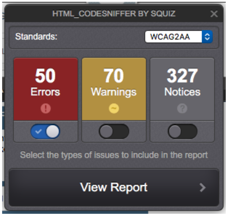
HTML_CodeSniffer is a JavaScript bookmarklet that I’ve use for a long time. I like that it works on Safari in your iPhone so you can do some testing beyond just VoiceOver on iOS. For complex websites CodeSniffer can be overwhelming because it generates a lot errors and there can be false positives depending on the techniques developers used to make a control accessible.
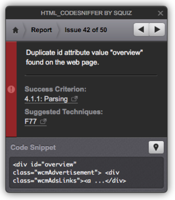
You do have to click next through all the issues to see the details for each sort of like aXe’s extension interface.
Pros
- Color Contrast testing and solution suggestions.
- Shows the HTML code of the error, shows related WCAG failure and success techniques.
- Bookmarklet so it works in all browsers.
- Iframe testing.
- Tests for duplicate ID attribute values.
Cons
- Issue Overload! Make sure to turn off Warnings at first to reduce the noise.
- False positives.
- Have to know how to read all the results and learn what to ignore and what is very useful.
- I don’t like that CodeSniffer says you can use a title attribute to fix a form input missing accessible name because then the label would not be visible.
Desktop vs Mobile Web Testing Tools
Some of the tools in this list will run from a mobile web browser like Mobile Safari on iOS or Chrome on Android. tota11y and HTML_CodeSniffer will work from any web browser because they’re JavaScript bookmarklets that are not installed as an extension.
Testing Responsive Design Websites
You can use these same testing tools to test a responsive website by adjusting the browser window size to be small like an phone or tablet or increasing the text size very large until you trigger the mobile device viewport sizes and for example make the hamburger menus display. Once you trigger the responsive views from your desktop web browser then you can run all the Accessibility testing tools we’ve covered.

For mobile sites that serve different HTML views based on the User Agent String you can switch your browser’s user agent to e.g. iPhone or iPad in desktop Safari under the Develop menu. Switch the user agent to a mobile string and now the browser will load the mobile content and you can run all these automated testing tools and do manual keyboard focus and operability testing.
Conclusion
Accessibility testing tools are a great way to learn accessibility and double or triple-check if your website is accessible. There are accessibility testing tools for your browser of choice or JavaScript bookmarklets that will run in any browser. Make sure to combine accessibility testing tools with your manual screen reader and keyboard-operability testing process and you will discover more issues and create a more usable website.
Share these accessibility testing tools with developers and designers and ask them to test their work as early and often as possible so most issues can be fixed before they get to QA testers or a11y experts.
There are many accessibility testing tools available that I did not have time to cover in a single blog post. I have more linked from my Resources page, and please share your favorite a11y testing tools in the comments below.
Is there a certain a11y testing feature that you want or need in a testing tool? Let us know in the comments, maybe someone else knows of a tool that can do the job or maybe you’ll motivate someone to build that tool.
Marcy Sutton says:
> “No false positives may mean less accessibility errors are shown that other tools might discover.”
It’s a delicate balance providing value with low noise. In your position as an experienced accessibility expert, you might be okay with weeding through noise. But for most people just getting into accessibility testing, false positives can be misleading. They also reduce the likelihood you’ll keep using a tool, if it generates a lot of unnecessary feedback.
Because there are limits with what can be reliably detected through automation, the axe-core API and extensions do provide an additional list of “Needs Review” issues for those who want more comprehensive reporting. It also includes best practice rules.
> “aXe doesn’t visually highlight the errors on the page where they stand out easily.”
This isn’t true–the aXe Chrome and Firefox extensions have a highlight mode that shows you the violation on the page.
>”aXe Issues have to be read one at a time in the extensions so you will hit Next a lot.”
This isn’t exactly true either. In the axe-core API, results are grouped by each rule, so within a violation you have multiple nodes: one for each violating element. They are deduplicated about as much as you can without throwing too much information at the user at once. The JavaScript API output can be manipulated into any presentation you like.
Paul Adam says:
Thanks for the feedback Marcy! For the visual highlighting of the a11y errors I mean that aXe does not highlight many errors at once like WAVE, a11yTools, and tota11y. It’s more like HTML_CodeSniffer in that you have to click next to highlight each error one at a time. I do like aXe’ grouping feature. I’m usually running it from the Console in Safari and like that I can see all the elements with contrast failures grouped together or all elements with duplicate ID attributes grouped. aXe does not make for as good of screenshots of the direct violation in the page because the highlighting is just a simple border around the failure and all the details is at the bottom in the extension. This is why I use so many different tools they all have different features I like. Thanks again for the response!