At first glance, the WCAG 2.0 AA guideline for contrast minimums appears to be one of the easiest, most straightforward success criterion to achieve. Yet, it is a real possibility for a site meeting WCAG 2.0 AA guidelines to be difficult to use, or even be unusable, for low vision users. The reason for this is that WCAG 2.0 contrast requirements are limited to text.
This is what Understanding WCAG 2.0 tells us about contrast minimums:
1.4.3 Contrast (Minimum): The visual presentation of text and images of text has a contrast ratio of at least 4.5:1, except for the following: (Level AA)
- Large Text: Large-scale text and images of large-scale text have a contrast ratio of at least 3:1;
- Incidental: Text or images of text that are part of an inactive user interface component, that are pure decoration, that are not visible to anyone, or that are part of a picture that contains significant other visual content, have no contrast requirement.
- Logotypes: Text that is part of a logo or brand name has no minimum contrast requirement.
However, “Understanding WCAG 2.0” further specifies 6 notes defining contrast ratio and another 5 notes explaining large-scale text. Thus, complying with 1.4.3 isn’t as simple as meeting or exceeding contrast ratios of 4.5:1 for regular text and 3.0:1 for bold or large text.
Then, there’s 1.4.1 Use of Color which, in my opinion, might be the most controversial of all the success criterion. It states:
1.4.1 Use of Color: Color is not used as the only visual means of conveying information, indicating an action, prompting a response, or distinguishing a visual element. (Level A)
How could this be construed as controversial? One word … links.
Allow me a slight tangent to explain. It’s that time of year again. Time for well-wishes of peace on earth, and goodwill towards men. People are at their moral best, experiencing uncontrollable urges to help those less fortunate. In Chicago, where I work, I see this every year. Office buildings become host to coat drives, food pantries, and angel trees. It’s a magical time, when even the most tightfisted among us may be spotted handing a couple bills to the homeless man they’ve heartlessly strolled past for 11 months. So, it is in this spirit of kindness, that I implore you, for the love of all that is good in this world, just underline your links! I can think of no better user experience than one in which the user immediately recognizes and understands which elements on the page are interactive. And what is more universally understood to mean “link” than an underlined word or phrase?
Of course, this isn’t my first rodeo, people, so I expect that a portion of you, upon reading this, will mumble under your breath, or think quietly to yourself, something along the lines of, “Underlined links are ugly, and there’s no way I’m going to underline my links!”. While you have the freedom to feel that way, I’m here to tell you that this type of sentiment is a “Bah, humbug!” to usability!
First, let me remind you that links serve a purpose. They tell the user which words on the page are interactive.
Second, although I said “underline”, there is more than one way to skin a cat. (Note: this is a proverbial saying. I do not promote the harming of animals!) Links can be designated with a graphical element like an arrow or greater than sign, or by using a larger, bolder font (but only when that visual style isn’t being used decoratively elsewhere in the design).
If you’re still unconvinced, there is one more option. It’s the controversial G183. It may be found in Techniques for WCAG 2.0, but I honestly consider it more of a loophole than a solution. It can also be tricky to pull off.
WCAG 2.0 Technique G183 states that “Using a contrast ratio of 3:1 with surrounding text and providing additional visual cues on focus for links or controls where color alone is used to identify them”.
If you’re wondering why this is tricky, it’s because there is a very limited number of colors combinations that can meet or exceed a contrast ratio of 3:1 against surrounding text and 4.5:1 against the background color. The W3C provides a list of these colors. However, these colors only work in combination with black text on a white background. All the minimalists out there who love using gray text on a white background, you, my friends, are out of luck.
While I’m at it, WebAIM suggests the following colors as acceptable options for non-underlined links because these colors each meet guideline 1.4.3 by having a contrast ratio of at least 4.5:1 against the white background and 3.0:1 against the surrounding black text.
- Normal: #3344dd
- Hover/Focus/Active: #bb1122
- Visited: #884488
However, while these colors each have sufficient contrast to pass using the G183 technique, the color recommendations in context are being used as a visual means of conveying information. This breaks guideline 1.4.1, the controversial “use of color” guideline.
Even if this didn’t break guideline 1.4.1, shouldn’t the “Hover/Focus/Active” state and the “Visited” state have a minimum contrast ratio of 3.0:1 against the normal link state color, so as to create a discernable difference for low vision users?
In the WebAIM example shown above, the contrast ratio of the “Normal” text color against the “Visited” text color is just 1.07:1, a nearly insignificant change. (For your reference, the contrast ratio of any color against itself is 1.0:1.)
The remainder of this article follows this line of reasoning.
Placeholder text
Placeholder text inside an input field is often styled to look disabled. And while it’s understandable for a disabled interactive element to not have contrast, placeholder text in an input field provides users with a hint on the type of information to enter, or the correct format in which to enter it. For example, a placeholder text of MM/DD/YYYY inside an input field labeled “Date” tells users the how to correctly format the date in that field. How beneficial is hint text, though, when the contrast ratio is so low that only users with 20/20 vision can see it? Of course, if you were to consult the Nielsen Norman Group, they would tell you this is a moot point because user testing continually shows that placeholders in form fields often hurt usability more than help it, so let’s call it a draw and move on.
Focus indicators
For low-vision keyboard users, having visible focus indicators that are actually visible to them are of utmost importance. Keyboard users need to know where they are on a page. Period. They should also be able to easily tell which item in a drop-down menu is selected and which tab in a tab list is active.
The following screenshots from amazon.com show how the department select box looks when it has focus and when it does not. There are surprisingly quite a few poorly designed focus indicators on the Amazon homepage, and one is a perfect example for proving my point.


With a contrast ratio of just 1.73:1 between the darkest portion of the in-focus menu and the same menu without focus, this is an unacceptable visual focus indicator, and something I would consider a usability fail. It’s unlikely that a keyboard user with low vision would see such a slight change in color.
Navigational elements
The design style being used to indicate the selected item in the following vertical navigation menu is another example of “color only” and poor contrast ratio. The white text color of the selected menu item has a contrast ratio of just 1.72:1 against the almost white text color of the other menu items.
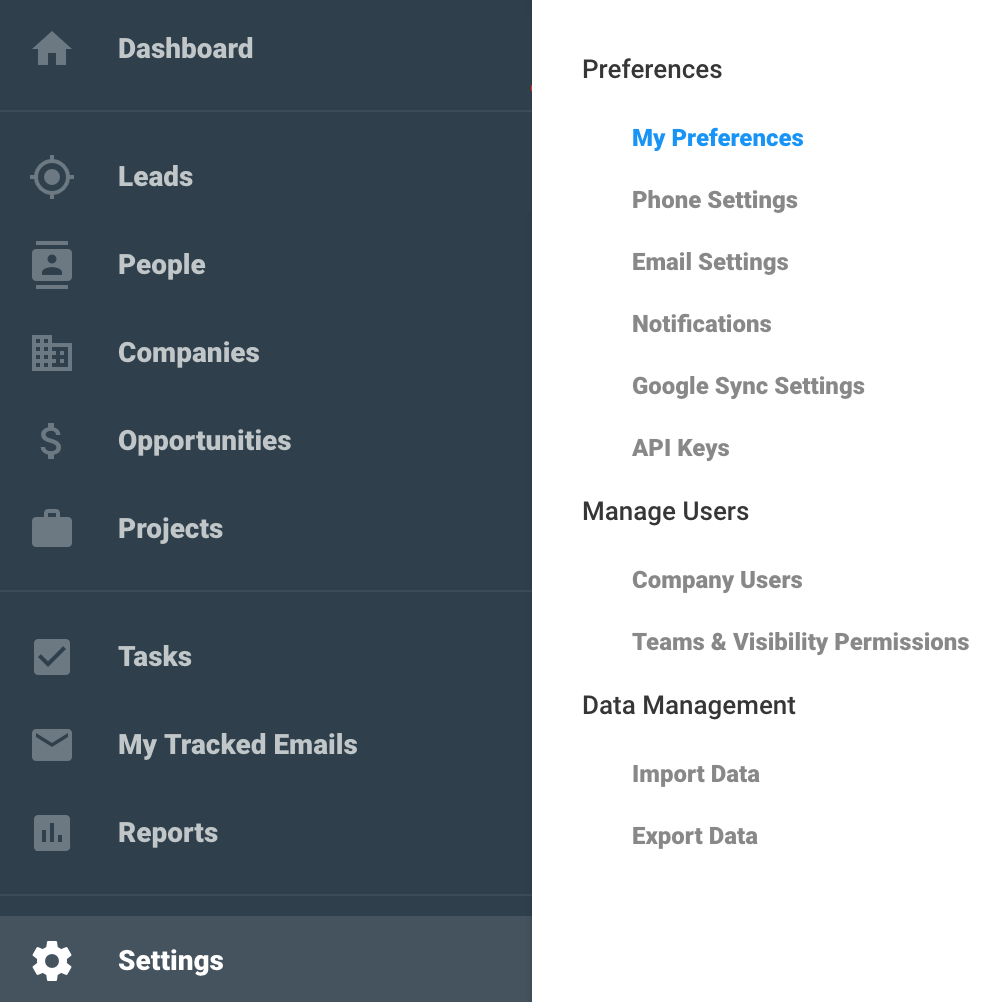
And while the design uses an additional color block to indicate selected vs. unselected menu items, the contrast of this highlight color against the normal background color is even lower than the contrast ratio of the text. Having contrast ratios this low can create usability issues for low vision users because they will not pick up on these subtle differences in color. An easy solution to this is to add a simple graphical element (with a contrast ratio of at least 3:1) to the highlighted or selected state, as I have done in the following example. The addition of a small white triangle pointing towards the word “Settings” solves the accessibility problem by giving users a clearer visual indication of which menu item is selected.

Toggles
There are a number of ways to check a design for low vision accessibility, but one quick and painless method is to simply simulate having low vision. This can be done by adjusting the display accessibility setting (an Accessibility Preference available on every Mac). While this can improve usability for certain people, it isn’t a universal solution and won’t solve every low vision problem. On the contrary, it can cause a few accessibility problems of its own. Most notably with low contrast interactive elements like toggles, checkboxes, radio buttons, and maps.
The designer of the following toggle obviously had accessibility in mind enough to include the words “On” and “Off” in the design (bravo for that, my friend) but this design still fails for accessibility because it lacks sufficient contrast to make the toggle visible to low vision users.
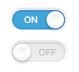
The example below shows how this toggle looks when the user increases their display contrast halfway between normal and maximum.
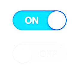
The result of this accessibility settings change is that the toggle becomes utterly useless when in the off position. You can hardly even tell it’s there, in fact.
Checkboxes and radio buttons
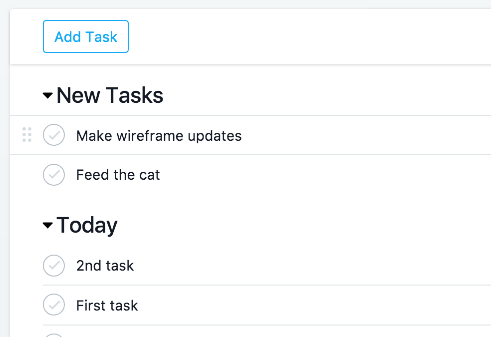
I’m a huge fan of using Asana to organize projects and deadlines, but the poor contrast of the drag icons and checkboxes (or perhaps I should call them check circles) on asana.com can create accessibility issues for low vision users. The contrast ratio of the checkboxes against the white background is 1.86:1, while the contrast ratio of the drag bar icon against the white background is even lower. The usability of these features isn’t great for low vision users who may have difficulty finding these interactive elements on the screen.
Maps
Google maps is one of the most used online map sites. Though the visual design is always improving, Google maps has yet to improve the contrast minimums of the non-text elements of their maps. The colors used to represent roads, land, water, grass, and buildings all but disappear if you happen to have the display contrast setting set midway between normal and maximum. It is so unusable that I can’t imagine a low vision user would even bother trying to use Google Maps without the help of a screen reader.
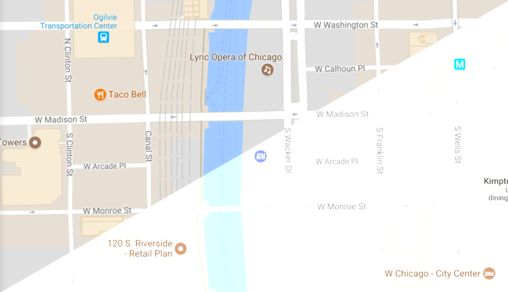
My intent here isn’t to shame any designer, site, or company, it’s to increase awareness. Don’t assume that if the design passes WCAG 2.0 AA guidelines 1.4.1 and 1.4.3, it is automatically accessible to low vision users. Review your designs manually! Use your computer’s display accessibility settings to simulate having low vision. If you’re still able to easily make out the details of the interactive elements, data charts and tables on the page, you probably have a pretty solid, design on your hands.
Let’s make 2018 the year we put empathy back into the design process. (Bonus: if you start now, you’ll be one of those super cool people who is always ahead of the trends!)
Mikey Ilagan says:
Fantastic article. The WCAG guideline on color contrast never seemed comprehensive enough and the examples you’ve highlighted are the same kind of things we’ve been trying to push internally.
Beth Raduenzel says:
I was reviewing the Candidate Recommendation of WCAG 2.1 this morning and thought you may be happy to know that it now includes…
1.4.11 Non-text Contrast:
The visual presentation of the following have a contrast ratio of at least 3:1 against adjacent color(s):
User Interface Components
Visual information used to indicate states and boundaries of user interface components, except for inactive components or where the appearance of the component is determined by the user agent and not modified by the author;
Graphical Objects
Parts of graphics required to understand the content, except when a particular presentation of graphics is essential to the information being conveyed.
Beth Raduenzel says:
Thanks, Mikey. I’m glad you enjoyed it. Hopefully, the next iteration of WCAG will provide more guidance on color as it relates to usability.
Kurt Mattes says:
Well said! Could not agree more. Would extend the thoughts to icons as well.