Gift card usage is exploding. 2017 gift card usage is projected to top $300 billion, with an average growth rate of 10%. While they tend to be viewed as impersonal, they’re convenient and popular, especially this holiday season.
So you received an email with your gift card redemption information. Congratulations. Question: can you actually redeem that value and apply it to your account? If you have a temporary or permanent disability, possibly not.
Note
I am not calling out any one retailer, as the lack of attention to accessibility issues is a global problem.
The Gift Card Redeption Email
After a recent meetup, where we gave away several gift cards, I was in the process of sending a gift card to a winner who is blind. Before hitting send, I decided to check out the email to ensure the winner could access the “button” to add the value to their account.

Everything visually looked accessible, so I decided to take a look under the hood, in the code.
<table ...>
  <tbody>
    <tr>
      <td ...>
        <a id="..." href="...">
          <img src="..." class="...">
        </a>
      …
      </td>
    </tr>
  </tbody>
</table>
I took a final step and opened VoiceOver, the free, built-in screen reader on the Mac platform and listened to the experience.
“link, image Q1%462T%3QT%26W% … “
The visual button is a link, wrapping an image with embedded text that provides no text alternative. Without the text alternative, the screen reader communicates the next best thing … the image filename, which in this fairly common case, is not a good thing.
What pains me is that there is only one attribute required to make this accessible … alt.
<img src="..." alt="Apply to your Amazon Account" class="...">And with a value of the embedded text in the graphic, you have an accessible gift card redemption link and most importantly, provided independence to an individual who wishes to redeem their gift card.
Rant
Retailers, before you spend hundreds of thousands of dollars in huge projects to make your websites more accessible (for whatever motivation), do the simple things right now, that can be incorporated into a sprint next week, with one Jira ticket and about 15 minutes of resource time.
Sensing the potential for failure in redeeming this gift card, I decided to send the winner the step-by-step instructions, providing the URL and claim code.
The Gift Card Redemption Page
So, everything will be fine from this point forward, right?
Well, one moment.

While I was happy to see that, on page load, the focus was placed on the claim code input field, but was the visual label “Enter claim code (dashes not required)” associated with that field?
<label id="..." class="..."><b>Enter claim code</b> (dashes not required)</label>
<div class="...">
  <div id="..." class="...">
    <span class="..." data-action="..." data-gc-redemption-code-input="{}">
      <input type="text" required="" id="..." name="claimCode" class="..." autofocus="autofocus" value="">
    </span>
  </div>
</div>
Sadly, it wasn’t. There was a label, however, there was no for attribute, referencing the id of the associated text input field. This creates this experience when using a screen reader:
“required, edit text”
Okay, what’s required and what text am I editing? Some of you may state, “well, the context of this task is to redeem the gift cards claim code, so what else would you expect to enter?” Do I need to define the word “assume” for you?
The following simple fix:
<label for="redeem" id="..." class="..."><b>Enter claim code</b> (dashes not required)</label>
<div class="...">
  <div id="..." class="...">
    <span class="..." data-action="..." data-gc-redemption-code-input="{}">
      <input type="text" required="" id="redeem" name="claimCode" class="..." autofocus="autofocus" value="">
    </span>
  </div>
</div>
… and now for a collective sigh, celebrating a most accessible user experience, as spoken by a screen reader:
“Enter claim code dashes not required required, edit text”
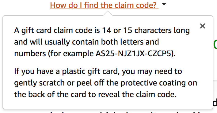
Before I finish up, one last, nagging item. Under the claim code text input field (which, by the way, is not in the expected focus order, but I digress …), there is a link with the text “How do I find the claim code?” I would think this information would be very helpful if you received an actual, physical gift card, and wasn’t sure exactly which information was the expected claim code. However, a person limited to using a keyboard to navigate a web page, including a screen reader user, would have no way of accessing this information. This is due to the way this “link” is coded (I use “link” loosely here, as while it is leveraging the HTML anchor tag, an href attribute value of javascript:void(0) is not within the anchor’s scope of navigating to another resource) and that the tooltip’s content is not associated with this interactive element.

Placing the potential link vs. button discussion for another time, by associating the link with the tooltip content using aria-labelledby, the screen reader will automatically read the associated tooltip content.
<a href="..." class="..." aria-labelledby="gc-find-claim-code-info">
   How do I find the claim code?
   <i class="a-icon a-icon-popover"></i>
</a>
...
<p id="gc-find-claim-code-info" class="a-spacing-small">
   <span> A gift card claim code is 14 or 15 characters long and will usually contain both letters and numbers
   (for example AS25-NJZ1JX-CZCP5).</span>
</p>
“link, A gift card claim code is 14 or 15 characters long and …”
I hope that with this brief article, I’ve highlighted how remediating some very common coding missteps can make a huge impact in the lives of so many people.
Retailers, you can thank me by sending me … a gift card.